Character design might be more interesting than you think…
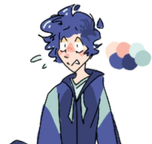
Character design might be more interesting than you think…
Character design: You might not realize it yet, but it is literally everywhere that you look. Remember your favorite movie? Even If it was live action, there was still character design used. And that cute little sprite you just made in computer science. Heck, you’re even pretty much character-designing yourself when you chose your outfit in the morning!
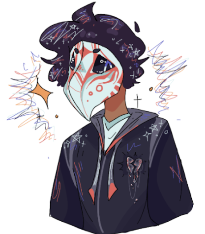
So why does such a commonly used concept always go so unnoticed in daily life?
Well that’s simple. Believe it or not, you do notice it! You’re always noticing it! Have you ever looked at a person wearing all black with heavy eyeliner and a choker necklace, and been a little bit (even just slightly) intimidated by them? Have you ever seen a little chibi cat drawing with big round eyes and thought, ‘aww, it looks cute and nice?’ That’s you recognizing character design!
Character design always affects our first impression of a character, which is often the most widely known thing about it, among artists. It’s often how we determine whether or not a character looks approachable and kind, shy and quiet, or brave and determined. However, the information you get from character design might go deeper than you realize.
For example, Pixar’s method is most likely the most obvious, as seen in their documentary. Have you seen the movie ‘Up’? In this movie, almost all the characters are assigned a shape. A rectangle or square for Carl, to show that he’s a bit stuck in his past ways, and doesn’t like change- as rectangles are thought of as more orderly and protective. It shows that he’s living his life sort of inside a box.
His wife’s shape is a circle, to show that she’s kind, friendly, and understanding. Now, how might these shapes be conveyed? With Carl, it’s mostly conveyed in his face- and same with his wife. But you also might notice smaller details, such as the pictures on the walls that have frames that are shaped based on the character.
And this brings me to what I like to call the Shape theory.
Shape theory is the idea that If you incorporate signature shapes into the character design, you can make them come off as more readable. For instance, as mentioned in the Pixar documentary, Inside out also used a lot of shapes to represent their characters. For Joy it was a star, Sadness, a teardrop, A brick for anger, Ect. Ect. and all of that was incorporated into character design!!!
So, this does seem like an amazing way to incorporate more emotion and uniqueness into character design- but how? How can one choose a symbol for PERSONALITY?!?!
Well, turns out there are endless sources to figure out a shape’s meaning. The most basic ones are Circles, Triangles, and Rectangles.
Circles-
These are often used to represent the most harmless characters. They are commonly kind and accepting, happy and empathetic. The characters often mean well, and are supportive and sweet. They’re free and well-meaning, and the most harmless.
Rectangles-
These often represent the most protective and loyal characters. Because of this, characters that are represented by rectangles often take charge in situations and consider themselves the leader of the group, or would at least do anything to protect the others. Rectangles can also represent a character that’s stuck in their ways.( ex: Vex, and Carl)
Triangles-
These are commonly used to represent the most dangerous characters, as triangles have the most sharp edges, and are commonly used for caution signs, or any other number of things. The characters are often out for themselves. They can also be rather sly characters, good or bad. They’re sometimes confident, (however not all of them, that’s more of a rectangular thing) And can be intimidating.
https://www.youtube.com/watch?v=v6lPsEPOIkM
There are many ways we can hide shapes in character design:
The shapes of buttons on a jacket, patterns on a shirt, the shape of a tail, the shape of the eyes, the way the hair pattern looks, ect. Ect, And It can be as subtle or as obvious as you want to make it! It can even just be as simple as a triangle-shaped locket.
Therefore, If you’re looking to design characters, I highly suggest choosing a symbol or two for each of them beforehand.
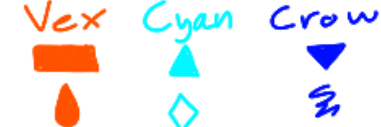
To show the transformation of these characters, let’s design 3 friends by the name of Vex, Cyan, and Crow.
A tip I learned was that, In the character sketches, It’s a good idea to try and fit in as many signature/representing shapes as possible.
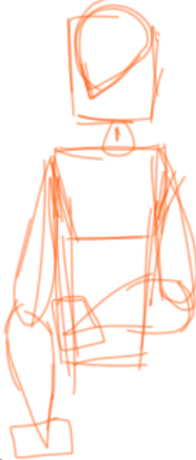
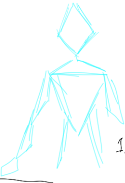
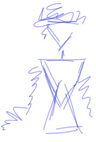
Try to sit back and imagine the personalities of these three. You might just think that these sketches look like a bunch of weird modern art, but you can already sense the emotion that’s being conveyed with the different shapes.
For Vex, you can already tell he almost looks like a robot: He seemed as if programed to do a set line of code, and looks like the least free one here- the most limited by his actions, personality, or whatever other situation is going on in his head.
For Cyan, She looks more orderly and neat, which represents her personality perfectly. I might have to work on her looking more dangerous, though, which means most likely adding more triangles- thankfully, that’s something I can fix in the line-art.
And for Crow, you can already tell by the scribbles that he’s an absolute frazzle-brained mess. However, he looks the most free out of all of them- but also a tad-bit dangerous looking. He seems almost mystical, like some sort of weird hallucination.
You can use the little shape combinations to slowly modify your character into a more human-like figure, while still keeping the defining traits that give off that sort of energy that you’re looking for in character design.
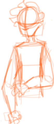
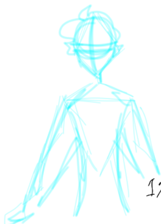
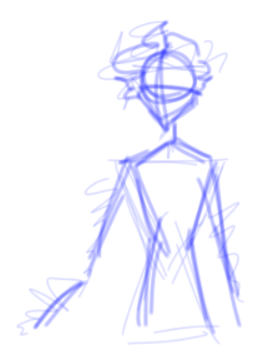
In order to try this, I attempted to put more human-like sketches over the old ones.
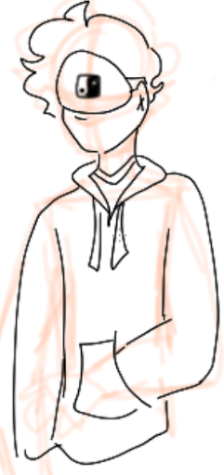
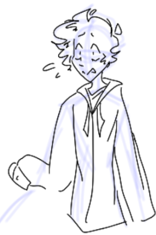
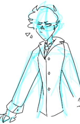
Okay, Vex looks like a bored teen, Crow looks anxious, and Cyan looks like a raging girl boss, so I think that my work here with the line-art is done.
However, character design can be a lot more than just lines. There are certain colors that help to represent personalities, or shape the overall vibes of the characters. Not only that, but coloring your characters creates a lot more opportunities to hide shapes and symbolism in your piece.
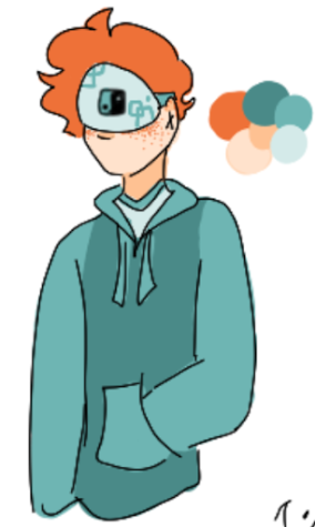
And despite this character now actually looking relatively human, you can still spot the places that rectangles or squares were used, despite being hidden by human features. This proves the effectiveness of hiding details like various shapes in character design- even if someone doesn’t actually notice it enough to point out the fact that the character looks rectangular, they still notice it in how it affects their first impression of the character- and their first impression helps them interpret the characters actions, or even their speaking role. It just helps people understand the character a little bit better.

No matter if It’s eye color, hair color, the clothes that are worn, body language, or even the length of hair, (see here for other ways character design is implemented )pretty much everything about any character is purposeful. From head to toe, everything means something, and everything affects how a character is seen.
So next time? Pay more attention when a friend shows you their drawing- It might mean more than you think.
Hello :3
I'm your average artist that draws way too much (ha) I plan on making a bunch of things for news media this year! (Also If my name...


