


Pantone Colors of 2016
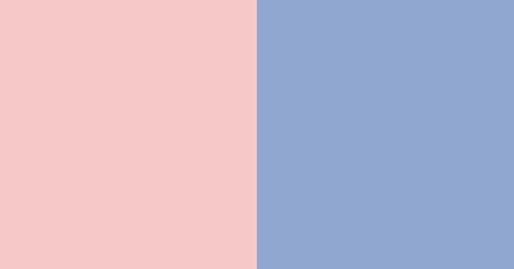
Ever since 2000, Pantone®, a company best known for it’s color matching system, chooses a color each year to represent “what we see taking place in our culture that serves as an expression of a mood and an attitude.” However, this year, Pantone has chosen two colors instead of one; Serenity, a baby blue color, and Rose Quartz, a soft pink.
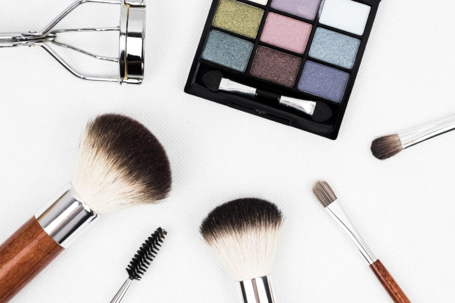
The colors of the year are used in many ways. Fashion designers might include them in their clothing line, and graphic designers use them when working with clients. “ Not only do these beauties stand incredibly on their own, they make a great pair for makeup looks, fashion and interior design too,” says Michelle Phan, a YouTuber and fashion guru. Despite having been announced only a few weeks ago, the colors have already been showing up on websites, runways, nail polish, and more.
Mrs. Martin, a language arts teacher for 8th graders found a creative way to incorporate the colors of the year in a class assignment. Martin showed her students the two colors and instructed them to rename them. Some of the titles they came up with include ‘Rosy Bloom’ and ‘Starlight.’ “We wanted to teach [students] about connotation,” said Mrs. Martin. The purpose of the exercise was to teach the students how to advertise by naming products.
The colors are all the rage, not just in the US, but all around the world. The next color (or colors) of the year will be determined in December, and announced in January of 2017. Who knows, next year they might even have three colors!