


An Overview of Horror Movie Posters
Featured Image by Oliver Barnfield
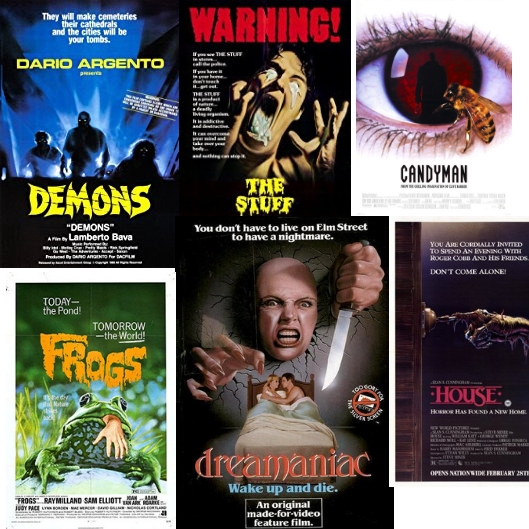
CLICK ON THE IMAGES TO SEE THE FULL GALLERY
Movie posters are what catch our eye in the theatre, and before the trailer became prominent, they were all we really had. I’ve written about this topic several times, and this time we’re going to take a look at the trends in posters from each decade from 50s to the 90s. In addition, there will be a gallery of the best and worst posters in each decade.
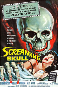
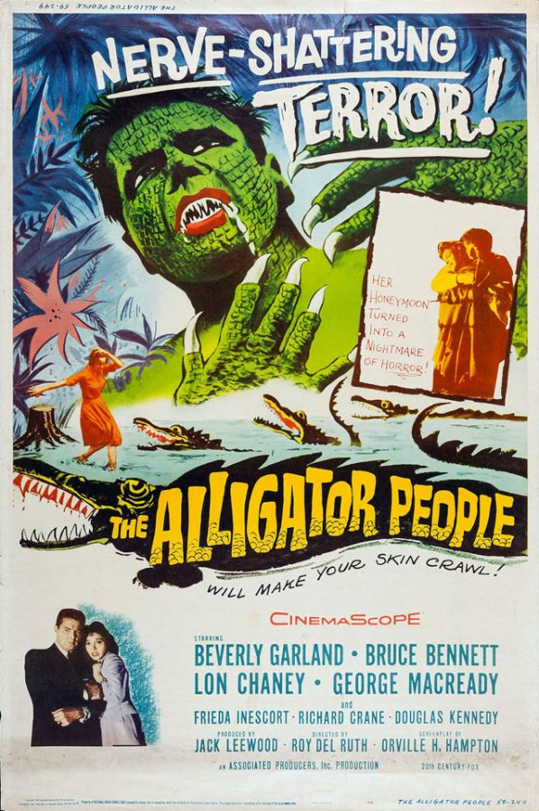
The 1950s/1960s
The posters of this generation usually had the head of the monster looming large, with some bold yellow text and a lady. These were almost always illustrated, and featured gaudy taglines. I’d say that the posters of this time period were incredibly important to a movies success, as trailers barely existed at the time. As a result, the posters had to catch your eye with a catchy name and a screaming woman.
The Best:
The Worst:
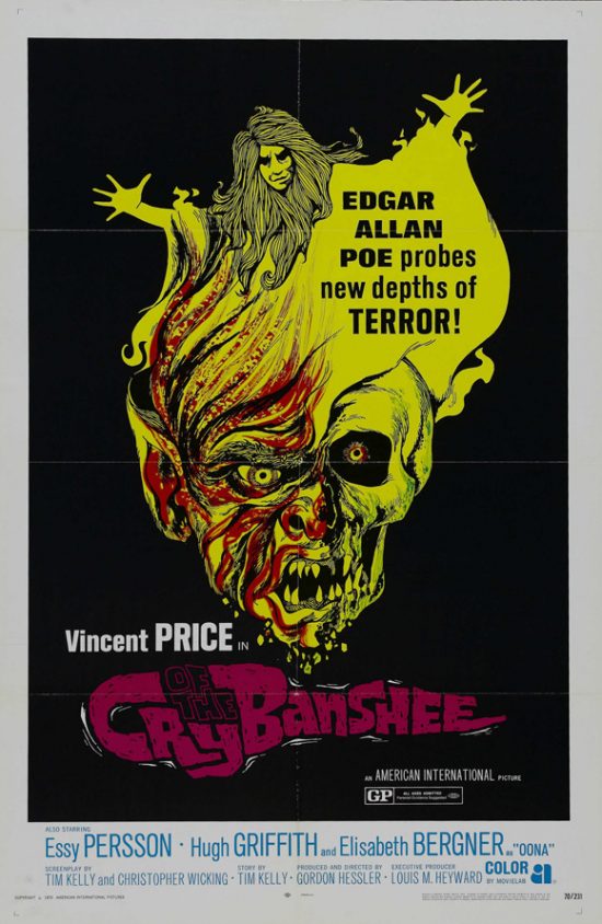
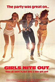
The 1970s
The posters of the 70s were a marked contrast to the 50s and 60s. They were stark and minimalist, but still retained the overblown taglines. The 70s also saw the rise of imported movies from Italy and other countries that made their way into America, often with revised poster art. The prevailing trend among the films of this era was demons and Satanism, a craze that started with The Exorcist. At the tail end of the decade, slasher movies boomed in popularity, which would carry over into the 1980s too, and these yielded some simple but cool-looking artwork.
The Best:
The Worst:
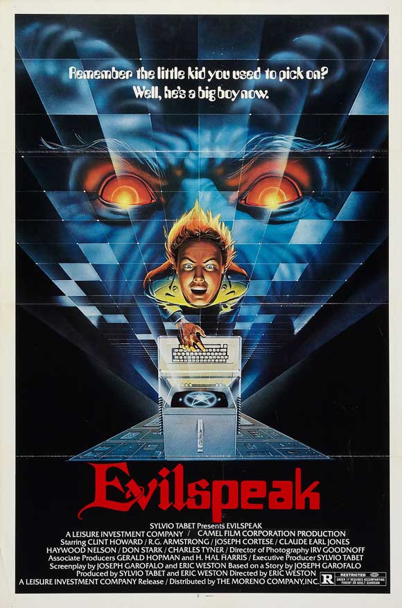
The 1980s
This is where posters really peaked. As the movies got more elaborate, and slasher movies took hold, the posters got flashier and more colorful, and as horror movie characters became more prominent (with the likes of Freddy and Micheal Myers) the posters showed off monsters that were clearly intended to kick-start their franchises.
The Best:
The Worst:
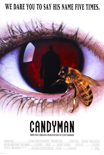
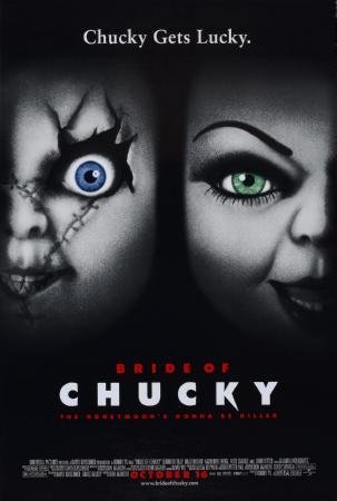
The 90s
After the golden period of horror movie posters in the 1980s, the 90s downgraded. Most were dull and grey, and most featured that blight on poster art: the floating head!
The Best:
The Worst:
CONCLUSION
So that was my walk through movie posters of each decade. I personally find it very interesting the way the different styles of art on these promos has changed, with each decade having its own distinct aesthetic. So how come I didn’t cover the 2000s and 10s? Well, they’re just very dull. And that’s an epidemic among movie posters in recent times. There’s no personality anymore, its all just muted colors and creepy dolls cobbled together in Photoshop. Here’s to hoping good posters will have a comeback.

Oliver is a Canyon Echoes veteran who currently works as Entertainment Editor, and he also directs and stars in The Opinionist, Canyon Echoes 1st video...